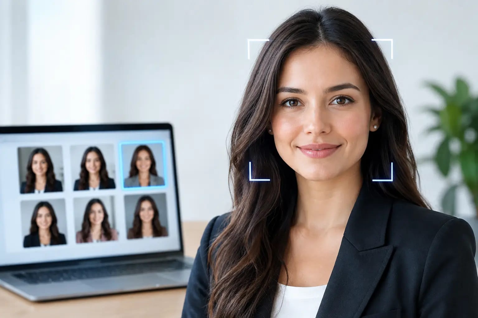
How to Choose a Headshot Photo for a Company Website

A company website can tell visitors what your business does in seconds. Your team photos tell them who they will be working with. That is why a “headshot photo for company website” is more than a profile image. It is a credibility signal, especially when a prospect is deciding whether to book a call, submit a form, or trust your team with an important decision.
The best company headshots feel professional without feeling distant. They look current, clear, and intentional, while still looking like the people customers will meet. Getting there does not require a full day of studio scheduling, but it does require a few standards that are easy to overlook.
What a Company Website Headshot Needs to Do
A strong website headshot has a different job than a casual social photo. It must hold up at a small size on a team page, look appropriate beside other employee photos, and give visitors a quick sense of confidence in the person pictured.
Clarity comes first. The face should be well lit, in focus, and large enough in the frame to remain recognizable on mobile. A visitor should not have to search through a busy background or guess which person is being introduced.
The image should also match the role and the business. A financial advisor, attorney, physician, and real estate professional may all need a polished headshot, but their most effective styling will not always be identical. Formal industries often benefit from classic wardrobe and restrained backgrounds. A creative agency or modern software company may have more room for approachable color and relaxed styling. The goal is not to flatten every personality. It is to make the visual choices feel deliberate.
Finally, a headshot needs to be current. If a client meets someone whose appearance is noticeably different from the website photo, the image has failed a basic trust test. Use a photo that reflects how you look now, including your usual hairstyle, facial hair, glasses, and overall presentation.
How to Choose a Headshot Photo for a Company Website
Start with likeness, then evaluate polish. A highly stylized portrait may look impressive at first glance, but it is the wrong choice if it does not look recognizably like the employee. The strongest image is usually the one that balances professional lighting and styling with a natural expression and accurate facial details.
Look closely at the crop. For most company directories and About pages, a shoulders-up or chest-up framing works best. It gives the face enough visual weight without crowding the image. Leave modest space above the head, and avoid crops that cut awkwardly through the chin, forehead, or shoulders.
Expression matters just as much. A slight, natural smile often reads as capable and approachable. A serious expression can be appropriate for some executive, legal, or medical contexts, but it should still feel engaged rather than guarded. If you are choosing between several images, favor the one that looks like a person a customer would be comfortable contacting.
Backgrounds should support the person rather than compete for attention. Neutral studio-style backdrops, soft office settings, and clean environmental backgrounds can all work. Avoid visual clutter, harsh patterns, crowded events, and backgrounds that create distracting lines behind the head.
Wardrobe should be chosen for the final placement, not simply for the camera. Solid colors generally reproduce better than tight patterns on a web page. A jacket, blouse, button-down, knit top, or other role-appropriate layer can add shape and polish. The most reliable choice is clothing that is aligned with your organization’s level of formality and that the person would plausibly wear when meeting an important client.
Keep team photos consistent, not identical
Consistency is often the difference between a company page that feels organized and one that feels assembled over several years. When every photo has a different crop, color treatment, background, and lighting style, visitors may not consciously identify the issue, but the page can feel less established.
That does not mean every employee needs the same expression, pose, or clothing. Consistency should come from shared standards: similar framing, comparable lighting, coordinated background choices, and a common level of formality. Individual personality can still come through within those boundaries.
For teams, decide on these standards before collecting photos. It prevents the frustrating task of trying to force mismatched images into a uniform grid after the fact. It also makes onboarding easier when a new hire needs to be added later.
Photo Quality Is a Website Experience Issue
A low-resolution or poorly lit image can make an otherwise well-designed website feel dated. Small thumbnails can hide some flaws, but they cannot fix blur, grain, strange skin texture, or an awkward crop. Company pages are frequently viewed on high-resolution screens, and visitors may click a photo to see it larger.
Use images with sufficient resolution for the layout, but do not assume bigger files automatically look better. Excessive sharpening, heavy filters, and aggressive skin smoothing can look artificial. Natural texture is preferable to a portrait that appears overly processed.
If you use AI-generated headshots, quality control is essential. Look for a process that checks whether the finished image still resembles the person, catches common artifacts around hands, glasses, teeth, jewelry, and hair, and provides a clear recommendation rather than leaving employees to guess which result is usable. Keeper Headshots, for example, evaluates source selfies before rendering and grades completed options for likeness and polish, which can reduce uncertainty for individuals and team administrators.
A Practical Workflow for Individuals and Teams
For an individual, the process can be straightforward: choose a recent, accurate portrait; verify the crop and expression at the size it will appear on the website; then make sure the background and wardrobe fit the company’s visual standard. Ask a colleague to review it if you are too close to the decision. People are often more likely to spot a distracting detail in someone else’s photo than in their own.
For a team, assign one person to set the visual direction and approve final images. That person does not need to be a designer, but they should have a clear reference for what good looks like. Establish the preferred orientation, crop, backdrop range, wardrobe formality, and file naming convention before images are uploaded.
It is also useful to request both portrait and square crops. A vertical portrait may work best on an About page, while a square version is more flexible for employee directories, speaker bios, Microsoft Teams, and internal profiles. Preparing both at the same time avoids a rushed recropping request later.
Check the photo where it will actually appear
Do not approve a headshot only at full size. Place it in the website layout or a representative mockup and review it on desktop and mobile. At thumbnail size, a good image should still make the face easy to identify. In a larger staff bio, it should remain natural and detailed without revealing retouching artifacts.
Compare photos side by side if they will appear in a grid. One unusually dark, warm, zoomed-in, or informal image can pull attention away from the rest of the team. Correcting that inconsistency before publishing is much easier than revising a live company page.
Mistakes That Make Team Pages Look Unfinished
The most common issue is using whatever photo is already available. An old conference snapshot, a vacation crop, or a webcam image may be better than a blank placeholder, but it is rarely a long-term solution. Another frequent problem is inconsistency caused by adding new employees over time without a defined photo standard.
Avoid using group-photo crops when possible. They tend to produce odd proportions, mismatched lighting, and a sense that the employee was added as an afterthought. Be careful with extreme poses, strong color filters, and backgrounds that reveal private spaces or personal information.
The right choice also depends on where the photo will be used. A founder’s media bio may benefit from more personality and a wider crop. A regulated-services team page may call for more uniform restraint. The standard is not “most formal.” It is “most credible for this audience and context.”
A company website should make it easy for visitors to see the real people behind the work. Choose headshots that are current, recognizable, and consistent, then give every employee an image they can feel confident sharing well beyond the team page.