Doctor Headshots for a Practice Website That Work

A patient has found your practice, checked that you accept their insurance, and landed on your physician bio page. Before they read a credential, they see a face. Doctor headshots for a practice website are not a cosmetic afterthought in that moment. They are a quick signal that the practice is current, approachable, organized, and prepared to care for real people.
A weak photo does not mean a physician is less qualified. But an outdated crop, uneven lighting, casual phone snapshot, or missing headshot can introduce doubt at exactly the wrong point in the patient journey. A strong portrait helps remove that friction. It lets patients put a recognizable face to the name on a referral, appointment reminder, or search result.
Why physician photos carry more weight than most team photos
Patients choose medical care under conditions that are often personal, stressful, or time-sensitive. They may be comparing several specialists with similar training and locations. When clinical information is broadly comparable, the practice website has to do a different job: make the decision feel safer.
A professional doctor headshot supports that decision without trying to oversell it. It communicates attention, presence, and professionalism before the first conversation. For a pediatrician, a warmer expression may help put parents at ease. For a surgeon, calm confidence and a clean, direct portrait can reinforce expertise. For a psychiatrist or therapist, an overly formal image may feel distant. The right choice depends on the specialty, the patient population, and the practice's broader visual identity.
The goal is not to make every doctor look identical. It is to make every profile feel like it belongs to the same credible organization.
What patients notice in the first few seconds
Patients rarely evaluate a headshot with the language of photography. They simply decide whether the person in it seems current, credible, and approachable. That judgment is shaped by a few practical details.
A recognizable, current likeness
The photo should look like the physician a patient will meet. This matters more than a dramatically flattering image or a highly stylized edit. A headshot that is ten years old, heavily retouched, or clearly disconnected from the doctor's current appearance can create an awkward first impression at check-in.
Aim to refresh physician headshots when a doctor changes significantly in appearance, joins the practice, takes on a more public-facing role, or when the existing image is visibly older than the rest of the site. Many practices also benefit from reviewing the full team page every two to three years.
Expression and eye contact
A neutral expression can be appropriate, especially in specialties that call for a more reserved presentation. Still, neutral should not read as uncomfortable or disengaged. A relaxed face, natural eye contact, and a slight smile are often enough to make a portrait feel open without becoming overly casual.
Avoid forcing every clinician into the same expression. A uniform wardrobe and background can create cohesion while allowing each person to look like themselves.
Lighting, crop, and background
Lighting should make the face easy to see, with no harsh shadows, strong color casts, or distracting glare on glasses. The crop should give enough space around the head and shoulders to work on desktop and mobile layouts. A tightly cropped image may look fine in a directory tile but fail when the web designer needs a larger physician profile image.
Simple backgrounds usually perform best. White, light gray, warm neutral, and subdued office-inspired tones keep attention on the clinician. A busy clinical setting can work for editorial content, but it is often less useful as the main bio portrait because it competes with the face at small sizes.
Doctor headshots for a practice website need consistency, not sameness
A practice website can feel fragmented when every photo has a different visual language: one physician has a vacation image, another has a formal studio portrait, and a third appears in a dimly lit office. Patients may not articulate the issue, but the page can feel less established.
Consistency gives the team page a clear standard. Establish a shared direction for background, crop, lighting, and general wardrobe level. Then leave room for individual differences. A cardiology group may choose dark blue or gray professional attire against a soft neutral background. A family medicine practice may favor slightly lighter colors and more relaxed expressions. Both can look polished if the choices are intentional.
A useful standard is to create two approved formats for each doctor: a vertical portrait for profile pages and a square crop for directories, appointment platforms, and internal tools. This prevents staff from repeatedly cropping a single image until it no longer looks balanced.
What physicians should wear
The best wardrobe is usually the one that looks credible, fits well, and does not distract. A blazer, collared shirt, blouse, polished knit, or professional dress can all work. A white coat is appropriate when it reflects the way patients commonly see the physician, though it is not required for every practice or specialty.
Keep patterns subtle. Fine stripes, loud prints, logos, and highly reflective fabrics can create visual noise, especially on a small mobile screen. Solid colors tend to hold up well. Mid-tone blues, greens, burgundy, charcoal, and soft neutrals are reliable choices, while bright white tops can disappear into pale backgrounds if the lighting is not managed carefully.
Wardrobe coordination should support inclusion rather than impose a narrow look. Give clinicians a shared palette or formality level, not a rigid uniform. The result will look more natural and more representative of the team.
A practical workflow for updating a physician team page
The easiest way to lose momentum is to treat headshots as a one-off design request. Make them part of a repeatable onboarding and website-maintenance process instead.
Start by deciding the visual standard before collecting photos. Choose the preferred background, crop formats, wardrobe guidance, and expression style. Next, inventory every existing team image. Flag photos that are missing, outdated, too casual, low resolution, or inconsistent with the new direction.
Then give each clinician a simple submission path and a clear deadline. Traditional photography is a sound choice when you need environmental images, a complex group photo, or a highly art-directed campaign. It also requires schedules, a location, and coordination that can be difficult across multiple offices.
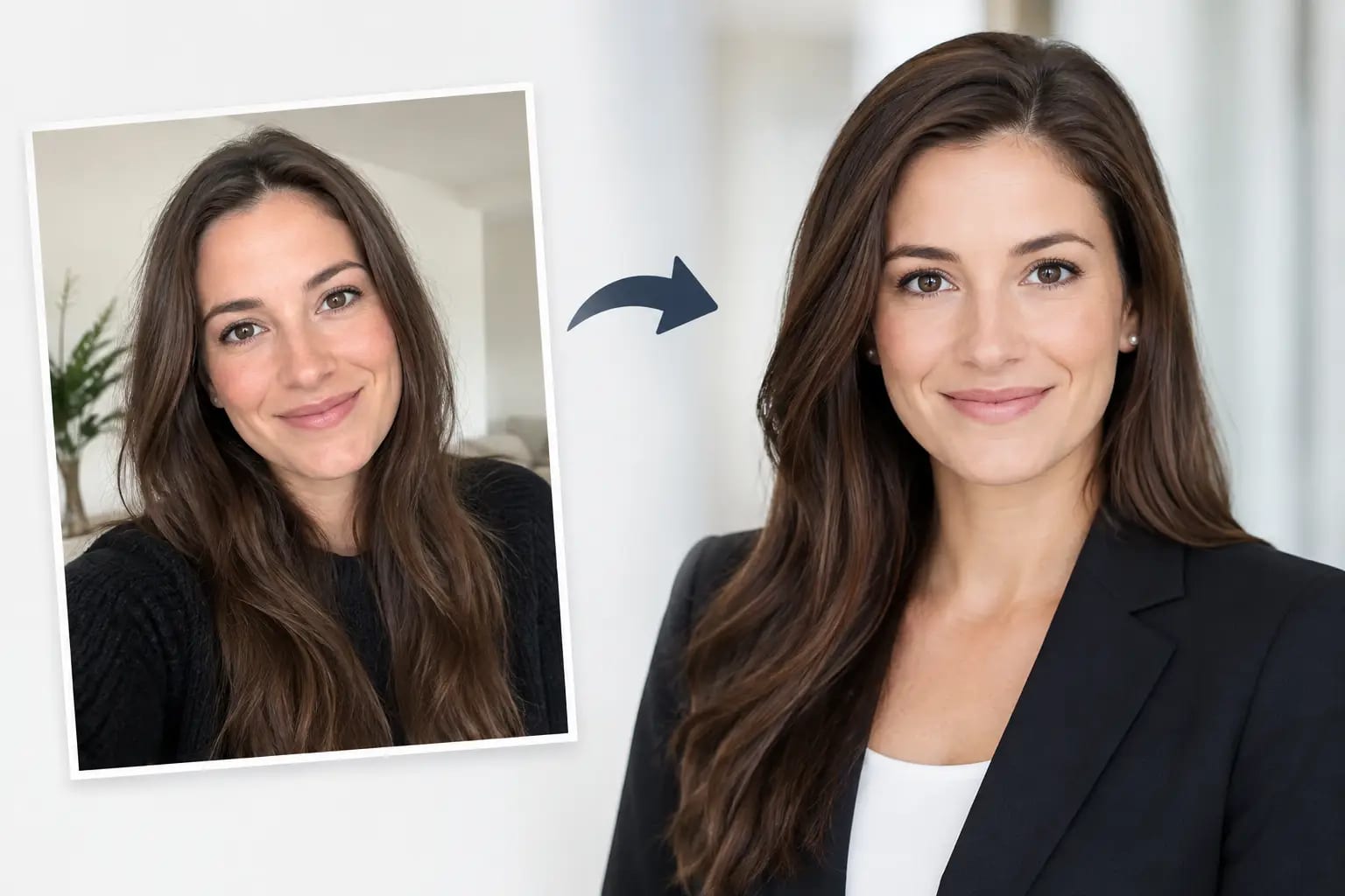
For a faster option, an AI headshot workflow can turn a small set of everyday selfies into website-ready portraits. Keeper Headshots, for example, checks source photo quality before rendering, lets users select professional wardrobe and backdrop styles, and reviews results for likeness and visible artifacts. That quality-control layer matters for physicians. The final portrait should look polished, but it should still look recognizably like the doctor patients will meet.
Before publishing, assign one person to review the full page at once. Check that names, credentials, specialties, and photos align. Review the page on a phone as well as a desktop monitor. A portrait that works beautifully on a large screen may look too dark or too tightly cropped in a mobile directory.
Avoid the common mistakes that make a page feel dated
The most frequent issue is not poor photography. It is inconsistency left unaddressed over time. A practice hires new clinicians, updates its logo, changes its website design, and never revisits the staff photos. Within a few years, the page becomes a collection of different eras.
Other avoidable mistakes include using group-event photos as profile images, applying heavy beauty filters, placing busy backgrounds behind every physician, and publishing low-resolution files that become blurry on larger displays. Be cautious with images that show patient information, charts, badges, or identifiable clinical spaces in the background.
There is also a trust consideration with AI-generated portraits. Do not use an image that changes facial structure, age, body shape, or other recognizable features. The point is an efficient professional presentation, not a fictional version of a clinician. Review every final image carefully and use only portraits that accurately represent the individual.
Give patients a clearer starting point
A physician bio page cannot replace bedside manner, clinical outcomes, or a thoughtful first appointment. It can make the first click feel more certain. When every doctor has a current, recognizable, well-lit portrait in a consistent format, patients spend less time second-guessing the practice and more time finding the care they need.
Set a standard that respects both the practice brand and the people behind it. A good headshot should make a doctor look prepared to meet the patient, not prepared to play a part.